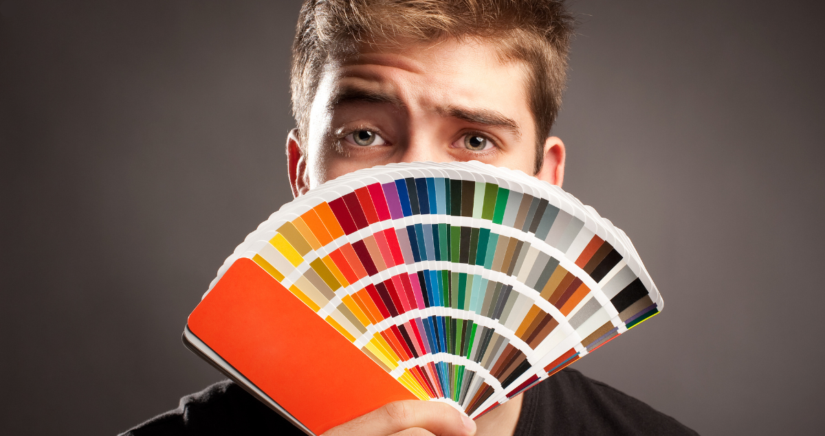
Since 1963, the Pantone Color Matching System (PMS) has been the global standard for accurate color matching for printing. Pantone’s owner at the time, Lawrence Herbert, recognized the need for a standardized color communication system to resolve inconsistencies in color reproduction across different industries. Today, PMS continues to help printers and designers to specify and control colors for printing projects. As the universal color language, it ensures the consistency of color whether you are printing brochures, yard signs, posters or invitations.
The Pantone Color Matching System
Imagine you are a designer in New York City, collaborating with a manufacturer in Shanghai. Even without a shared spoken language, the Pantone Color Matching System serves as the universal color language for print that you both understand. PMS enables both of you to communicate and achieve precise, consistent results. This standardization of the colors takes out all the guesswork since colors can appear differently under various lighting conditions or on different screens.
The Pantone Color Matching System ensures accurate color matching from design conception to final production. This is how it works:
- Pantone provides physical and digital color guides with thousands of pre-defined colors. Each color is assigned a unique name or number, ensuring precise communication of color specifications across teams and locations.
- For physical printing, Pantone colors are formulated using specific ink mixtures. These formulas are printed in the guides, allowing printers to mix spot colors precisely to match the desired hue. Each Pantone color is always made using the same proportions of base inks, guaranteeing uniformity.
- Pantone colors are often printed as “spot colors,” where the exact ink is used, rather than combining CMYK (cyan, magenta, yellow, black) inks. This ensures a perfect match, especially for vivid or specialty shades such as metallics or fluorescents. Pantone also provides CMYK equivalents of its colors for projects when spot printing isn’t feasible.
This combination of physical and digital guides along with precise ink formulas makes the Pantone Matching System indispensable for ensuring accurate, reproducible color for your next printing project.
2025: The Year of Mocha Madness
Pantone’s Color of the Year designation, which began in 2000, shows why this industry leader is known as the world’s authority on color. The chosen color sets the tone for the coming year and spreads across a multitude of sectors from clothing to housewares to tech gadgets. This much anticipated annual tradition (complete with an online countdown clock) has become iconic in the way it influences designers, brands and consumers. The color of the year is carefully selected based on popular culture and is said to reflect the global mood.
In December 2024, Pantone announced the 2025 Color of the Year: Mocha Mousse.
This warming brown hue is described as “imbued with richness…nurturing us with its suggestion of the delectable qualities of chocolate and coffee, answering our desire for comfort.” Picture the sensation of savoring a rich, chocolatey mousse—a true comfort food. That’s the essence of Mocha Mousse.
A Perfect Match
If the warm mellow brown hue of Mocha Mousse appeals to you, the Pantone Color Matching System facilitates this through the standardization of the color with its Pantone code of PMS 17-1230. The 2025 Color of the Year is expected to have significant influence in various print applications due to its rich, grounding tone and versatile appeal.
If a more classic color is what you are looking for, Pantone has a palette of over 3,000 colors optimized for digital printing. Two iconic colors – Pantone 186 C (a bold red) and Pantone 286 C (a deep blue) have been staples in printing for decades. No matter whether you’re seeking a trendy hue or a timeless classic, the Pantone Color Matching System will deliver the perfect match.
Trust the Color-Matching Experts
Pantone revolutionized the design, printing and manufacturing industries by creating a clear, reproducible way to match colors. At Target Print & Mail, we use the Pantone Color Matching System to ensure our printed pieces are bold, precise and exactly what you ordered. We’re proud to specialize in finding solutions for our clients so you get a final product that exceeds your expectations. Call today or click here to start your order.
