
Are you looking to choose a color that’s right on trend for your next project? Look no further than the recently announced Pantone Color of the Year: Viva Magenta. This color is a deep mauve-red tone and was chosen to represent joy and strength for the new year.
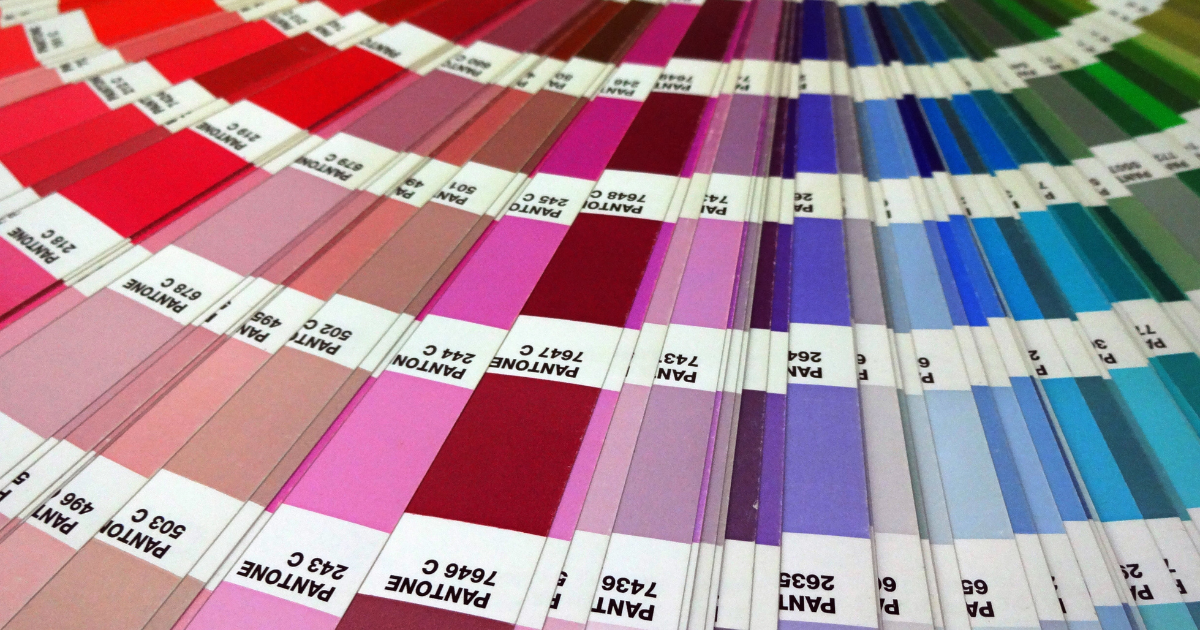
Not sure what all the hype is about? The Pantone Matching System is a color reproduction standard in which colors across the spectrum are each identified by a unique, independent number. The use of PMS allows printers to precisely match colors and maintain color consistency throughout the printing process. Here’s a history of the color-matching system, and how you can use it to your advantage.
Many years ago, The Pantone Color Institute saw the need for a system that would make color matching more precise. That way, when customers were placing an order for a certain colored carpet, ink or paint, they could be assured they were getting exactly what they ordered. To solve this problem, it created the Pantone Color Matching System. By 1963, the new system had grown in popularity and is still considered the go-to tool today.
To differentiate between different mediums and how colors appear between them, Pantone has two distinct systems. The Pantone Matching System (often abbreviated as PMS) is used for graphics, such as a digital and print. The second system, Pantone Fashion, Home + Interiors/FHI, is used for paint and textiles.
In addition to setting the standard for color-matching across the globe, Pantone is also famous for choosing the popular Color of the Year. The tradition dates back to 2000, when it announced the first ever choice: Cerulean (PANTONE 15-4020). According to its team, it wanted to set the tone for a new millennium with a cool, calm and peaceful color. From that point on, the announcement of the Pantone Color of the Year became an anticipated event. According to Pantone’s website, its color experts look for inspiration in food, fashion and even cultural events to find the next “big” color.
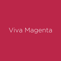 The 2023 color selection, PANTONE 18-1750 Viva Magenta, is vibrant and bright. According to the experts at the Pantone Color Institute, it is “a new animated red that revels in pure joy, encouraging experimentation and self-expression without restraint, an electrifying, and a boundaryless shade that is manifesting as a stand-out statement.”
While it has magenta in the name, this year’s color is a versatile shade of deep red that can be used in a variety of ways. From printed pieces to signs, you’ll be seeing a lot Viva Magenta in 2023.
At Target Print & Mail, we use the PMS system to ensure our printed pieces are bold, precise and exactly what you ordered. For digital jobs, we only use the system as a reference tool, but our expert team can still guide you to a near-exact color match. We’re proud to specialize in finding solutions for our clients so you get a final product that exceeds your expectations.
Call today or click here to start your order.
 850-671-6600
 hello@targetprintmail.com